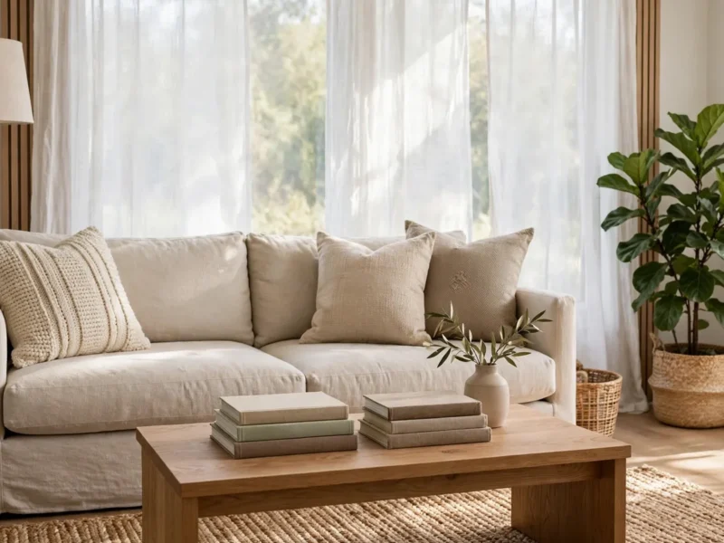
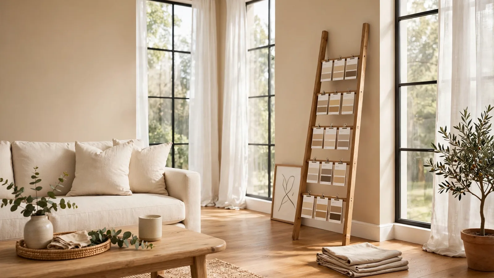
The best interior wall paint colors depend on your light, not the trends. For most rooms, warm whites, soft greiges, and muted greens in the LRV 55-80 range keep walls bright and open. Match undertones to your fixed elements — floors, cabinets, stone — and test swatches at three times of day before you commit. These 11 interior wall paint colors work in real homes.
Check These Three Things Before You Buy Paint
Undertones: The Color Hiding Inside the Color
Every “neutral” has a secret second color. Hold the swatch against a pure white card and you will see it: pink inside beige, green inside gray, yellow inside cream. Choose an undertone that matches your fixed elements — flooring, countertops, fireplace stone. This single check is what stops the classic “why does my living room look purple?” disaster.
LRV: The One Number Worth Reading
Light Reflectance Value runs from 0 (pitch black) to 100 (pure white), and it sits on the back of every swatch. Most main walls land between 55 and 80 — bright but not glaring. Below 55, you are deliberately darkening the space, which suits bedrooms and snugs but should be a choice, not an accident. Read this plain-English LRV explainer before your next paint run.
Your Room’s Light Direction
North-facing rooms get cool, bluish light that flattens color — warm them up with creamy whites or warm greiges. South-facing rooms get golden light that makes colors look truer and slightly warmer, so cooler shades stay honest there. West-facing rooms swing warm in the afternoon; balanced, desaturated hues hold steady through the shift. Direction changes everything, so test your shortlist on every wall.
11 Interior Wall Paint Colors Worth Trying
1. Warm White for the Rooms You Live In
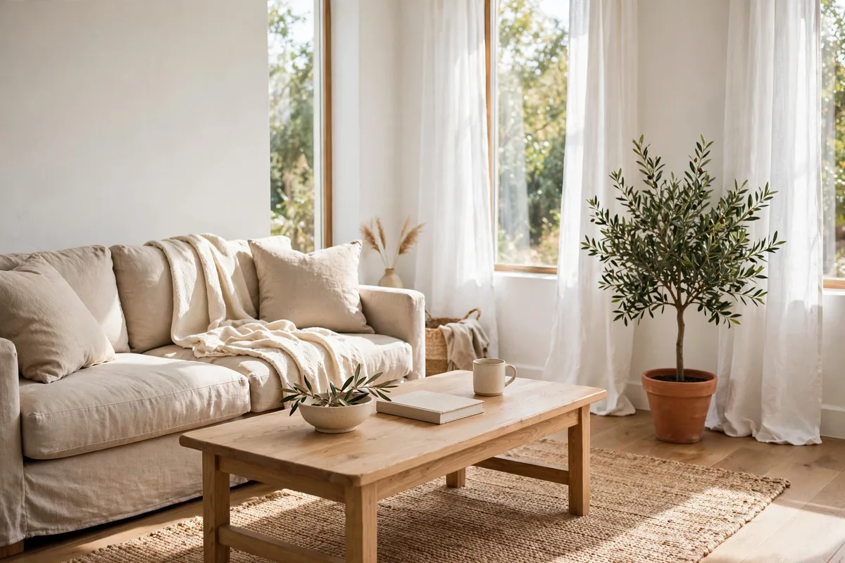
Warm white is the hardest-working of all interior wall paint colors. Benjamin Moore’s Swiss Coffee OC-45 carries a sunny undertone that keeps rooms glowing in low light — the brand’s own color experts recommend it for windowless spaces. It pairs with oak floors, brass, and linen without ever looking stark.
2. Sage Green for Calm Bedrooms
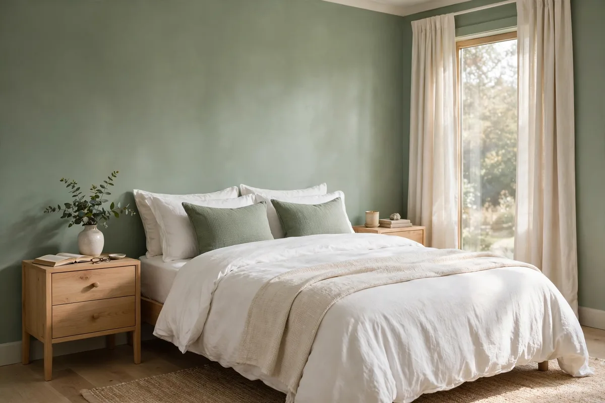
Sage reads as a neutral with a pulse — gray-green enough to sit quietly, green enough to feel alive. It loves white bedding and light wood, and it keeps its composure under both warm and cool bulbs. Few interior wall paint colors are this forgiving. Pair it with our small bedroom decor ideas if you are layering in new textiles too.
3. One Deep Navy Accent Wall
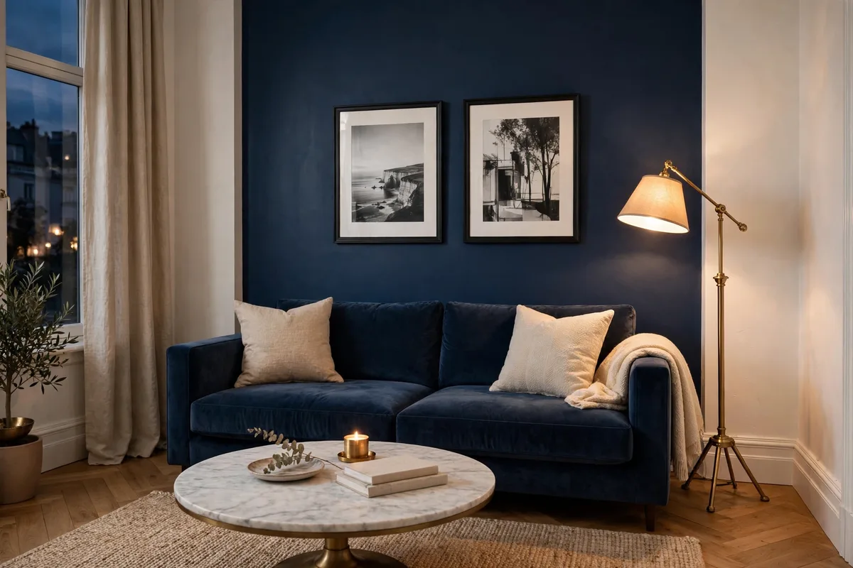
A single dark wall adds depth without swallowing the room. Keep the other three walls light, match the trim to the lightest wall, and let the navy carry the art. Designers use this move in small rooms on purpose — the dark plane recedes and the room reads longer. Balance it with warm wood and brass so it feels rich, not cold. Among interior wall paint colors, navy is the safest way to try dark.
4. Terracotta for Dining Rooms
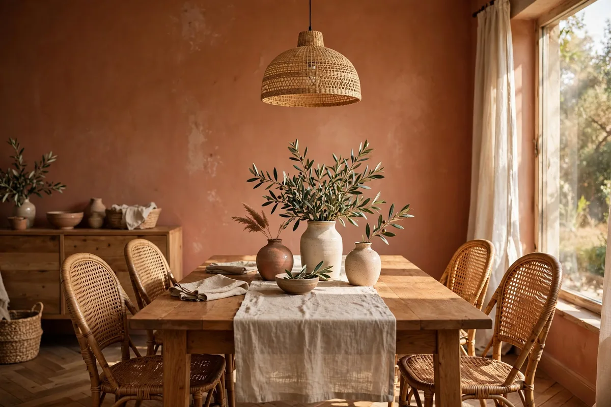
Earthy terracotta turns a dining room into the warmest room in the house. It flatters skin tones under candlelight and sits beautifully against rattan, oak, and cream linen. Because it carries a strong undertone, keep ceilings and trim a clean warm white so the color stays the star. One room of terracotta goes a long way — don’t carry it down the hallway. Warm interior wall paint colors like terracotta are made for rooms where people gather.
5. Soft Greige for Hallways and Open Plans
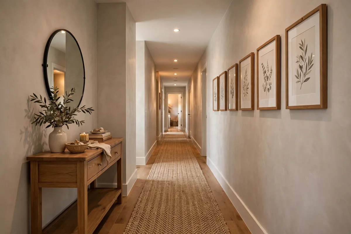
Greige — gray plus beige — is the peacekeeper of interior wall paint colors. Sherwin-Williams Agreeable Gray (LRV 60) is the textbook example: light enough to keep hallways open, warm enough to avoid the cold-gray look of the 2010s. It flows across open plans without chopping them into zones. When you are stuck between gray and beige, greige is the answer — the diplomat of interior wall paint colors.
6. Sample on Boards, Not Just the Wall
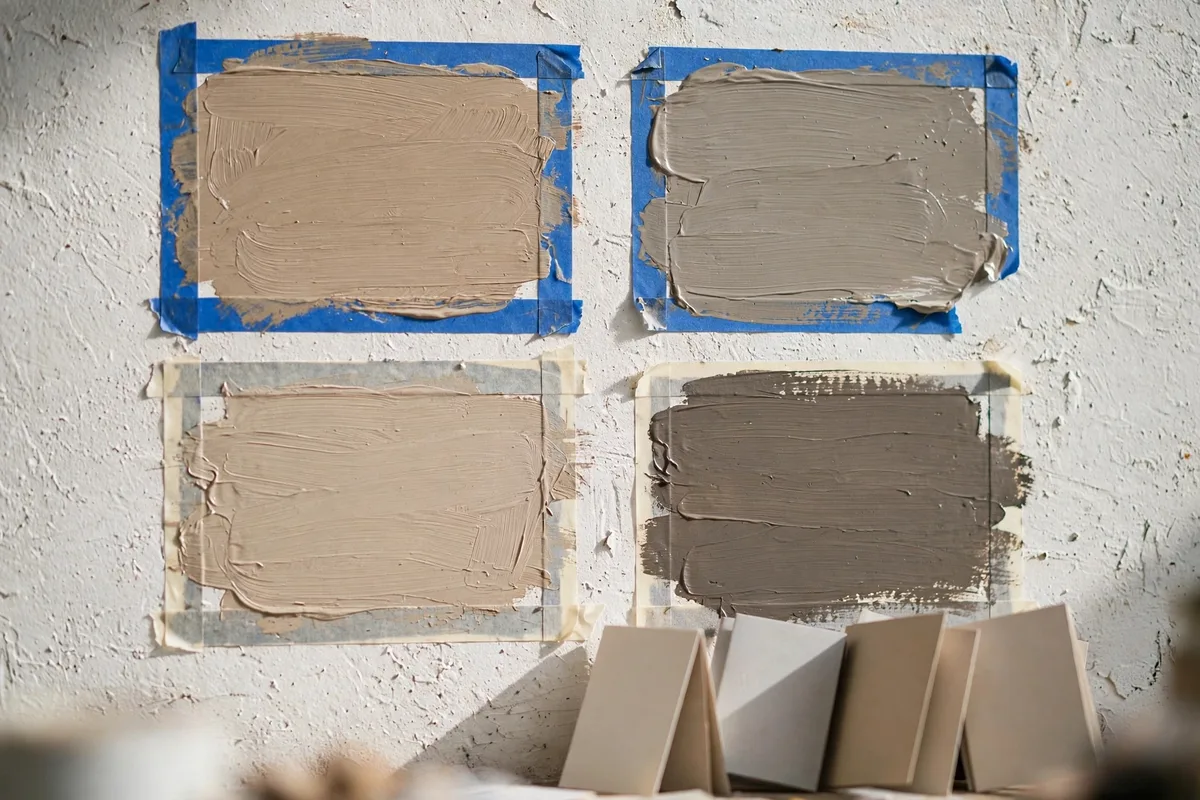
Never commit from a two-inch chip. Paint large swatches on foam boards and move them around the room — morning, noon, and evening with the lights on — for at least two days. Colors shift dramatically with light, and boards let you test without patching the wall. The best interior wall paint colors reveal themselves on the third day of testing, not the first. Buy three samples: your favorite, one shade lighter, and one cleaner version with less gray.
7. Match the Color to Your Room’s Direction
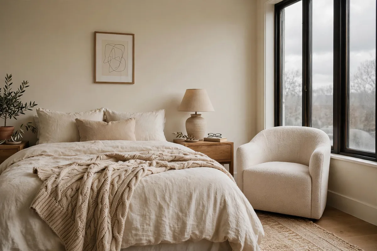
Light direction is the cheat sheet most people skip. North-facing rooms need warmth: creams, warm greiges, soft peaches. South-facing rooms handle cooler choices — pale blues and soft grays stay honest in golden light. East rooms get bright, cool morning light; west rooms get warm afternoon sun. Of all the interior wall paint colors rules, “match the direction” is the one that prevents the most repaints.
8. Satin for Bathrooms, Eggshell for Living Spaces
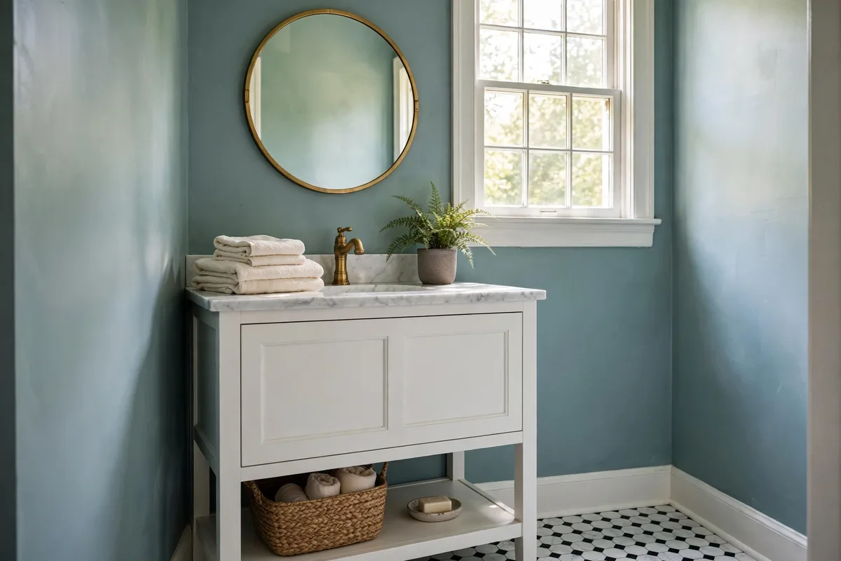
Finish changes how color looks and how walls survive. Eggshell — a soft, low sheen — is the everyday choice for living rooms and bedrooms: durable with a gentle glow. Satin handles the humidity and wipe-downs of bathrooms and kids’ rooms. Flat or matte belongs on ceilings and low-traffic adult bedrooms, where it soaks up color beautifully but shows every scuff. Get the finish right and any of these interior wall paint colors looks twice as good.
9. Don’t Forget the Fifth Wall
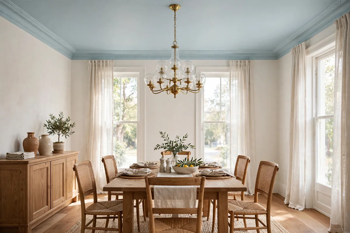
Painting the ceiling is the upgrade nobody expects. Try your wall color mixed at 50% strength on the ceiling — paint stores do this on request — for a seamless wrap that makes the room feel taller. A pale blue or soft cream ceiling over white walls adds quiet interest. Ceilings deserve a vote in your interior wall paint colors shortlist. Standard ceiling white can carry a blue-gray cast that fights warm walls, so tinting it to match pays off.
10. Pair Painted Cabinets With Quiet Walls
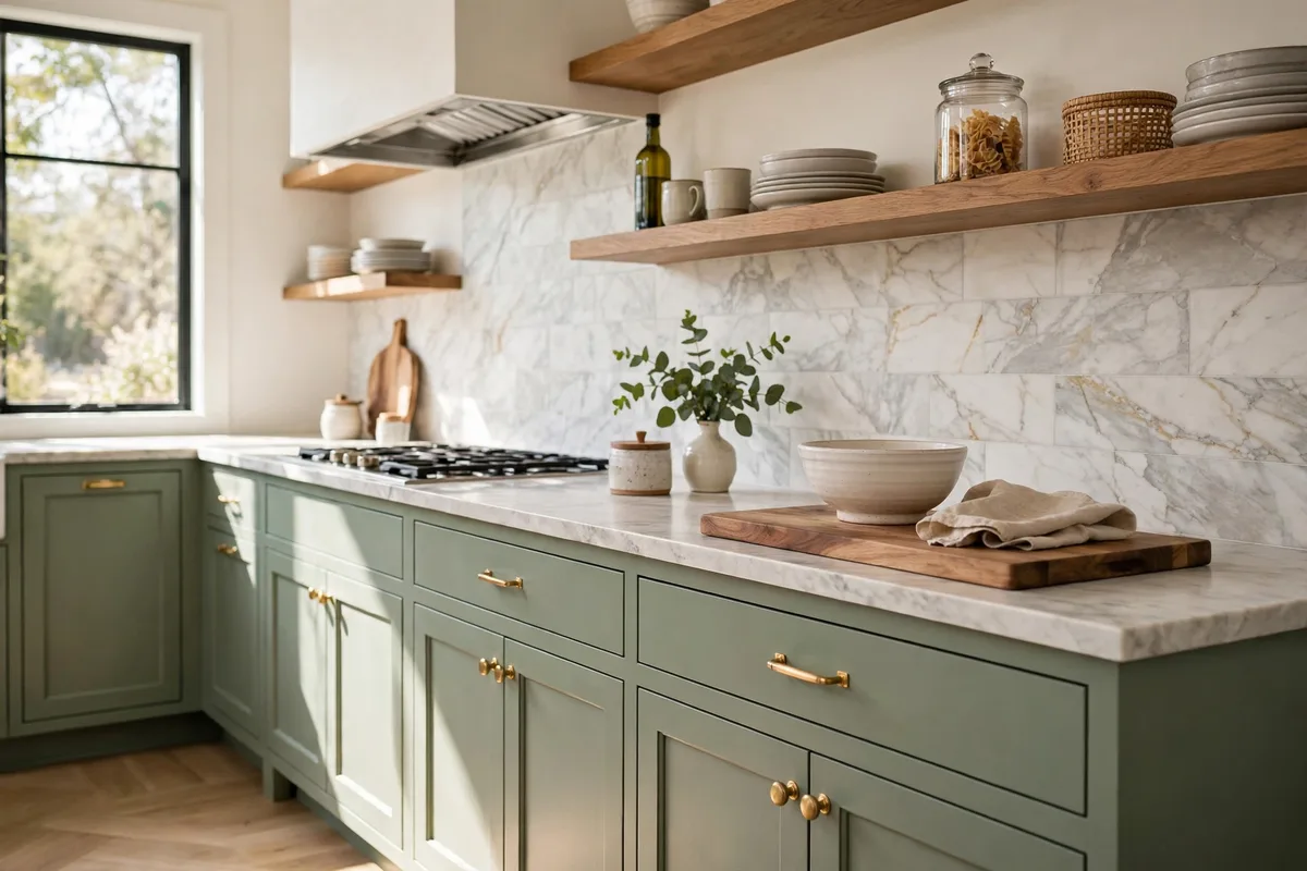
Sage or deep green cabinets against warm white walls is the combination that keeps showing up in kitchen refreshes — color where your hands are, calm where your eyes rest. Keep at least 20 LRV points of contrast between cabinets and walls so the undertones don’t fight. Cabinets are furniture, but the interior wall paint colors behind them decide the mood. See our ideas for painting kitchen cabinets and these Jaclyn Smith kitchen cabinet color dupes for the cabinet side of the equation, and browse our unique backsplash ideas for kitchens to bridge the two.
11. Go Dark in the Powder Room
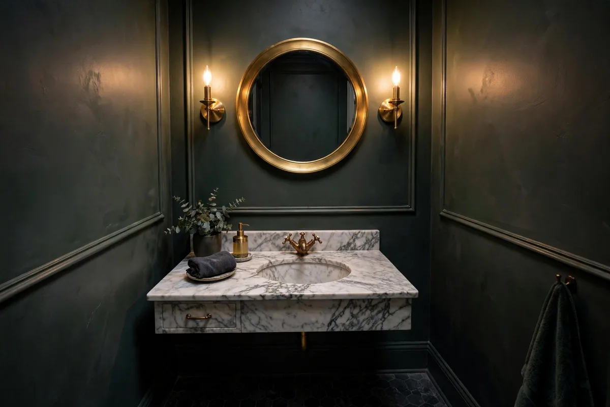
Small dark rooms don’t need “fixing” with white — white in a windowless bath can look dingy. Embrace the cave: a deep charcoal green like Urbane Bronze (LRV 8) with brass sconces and a round mirror turns a powder room into a jewel box. Dark colors absorb light, so give the room strong artificial light and one high-contrast mirror moment. Dark interior wall paint colors turn limitations into atmosphere.
📌 Saving paint ideas for your next project?
Pin this guide to your “Paint Colors” board on Pinterest so your swatch shortlist is one tap away at the store. Pin it now →
What Paint Finish Should I Use on Interior Walls?
Eggshell for living rooms and bedrooms — durable with a soft glow. Satin for bathrooms, kitchens, and hallways, where walls need wiping. Flat or matte for ceilings and low-traffic adult bedrooms; it hides imperfections but scuffs easily. Match the finish to the room’s traffic and moisture, not just the look you want. The right finish makes these interior wall paint colors perform as good as they look. Benjamin Moore’s own small-room color guide adds that higher sheens bounce extra light around tight spaces.
FAQs
What is LRV and why should I care?
LRV — Light Reflectance Value — is a 0-to-100 scale of how much light a paint color reflects. Higher numbers mean brighter walls. For most rooms, an LRV between 55 and 80 keeps things bright without glare. Check the number on the back of the swatch before you fall in love with a color.
What is a good LRV for interior walls?
Between 55 and 80 for most main walls. Above 80, a color reads as white and delivers maximum brightness — great for dim rooms and ceilings. Between 55 and 60, the color grounds the room while staying open. Below 55, you are deliberately darkening the space, which suits a bedroom or snug with good daylight but should be a conscious choice.
How does lighting affect paint colors?
Bulb temperature changes undertones: warm LEDs around 2700K enrich warm hues but can muddy greens, while cool 4000K light chills blues and grays. Always test swatches under your actual lights and daylight. A color that looks creamy in the store can turn gray in a north-facing room — which is why the foam-board test matters.
What paint color makes a small room look bigger?
Light, high-LRV colors open a room up: warm whites like Swiss Coffee, soft greiges, and pale blues that visually recede. Keep walls, trim, and ceiling within a narrow LRV band to remove the hard edges that chop a small room into pieces. One dark accent wall can add depth, but keep the other walls light.
Pick the room that bothers you most and start there — one wall of the right color changes the whole space. Which of these interior wall paint colors are you testing first? Tell us in the comments below.
💬 Your turn
Which room are you painting first — and did the undertone surprise you? Drop a comment below; we read every one. Keep planning: 15 interior design ideas for a better home, small bedroom decor ideas, and ideas for painting kitchen cabinets.