The most reliable interior colour combinations follow three rules: give each room one dominant colour with two supporting shades (the 60-30-10 split), keep the undertones in the same family, and test every paint swatch in your own light before you commit. Below are ten proven room-by-room pairings built on those rules, with concrete paint examples.
Most colour mistakes happen before the first coat goes on — not because the hue was wrong, but because two colours fought at the undertone level. A warm beige wall next to a cold grey sofa will always feel disconnected, no matter how nice each looks alone. The pairings below are chosen the way designers choose them: by relationship between hues, not just by vibe.
10 Interior Colour Combinations That Work Room by Room
1. Navy Blue + Warm White (Living Room)
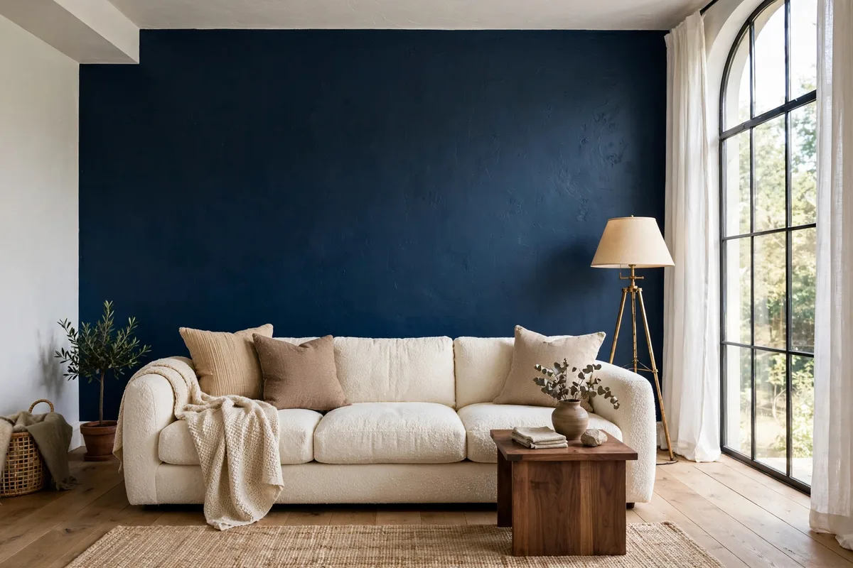
A deep navy accent wall behind a cream boucle sofa is one of the most dependable interior colour combinations for a living room — the navy adds drama while warm white keeps the room bright. Add brass or walnut wood so the cool blue never reads cold. Shades like Sherwin-Williams Naval (SW 6244) with Alabaster (SW 7008) trim nail this exact pairing.
2. Sage Green + Creamy White (Bedroom)
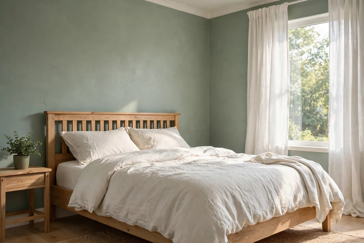
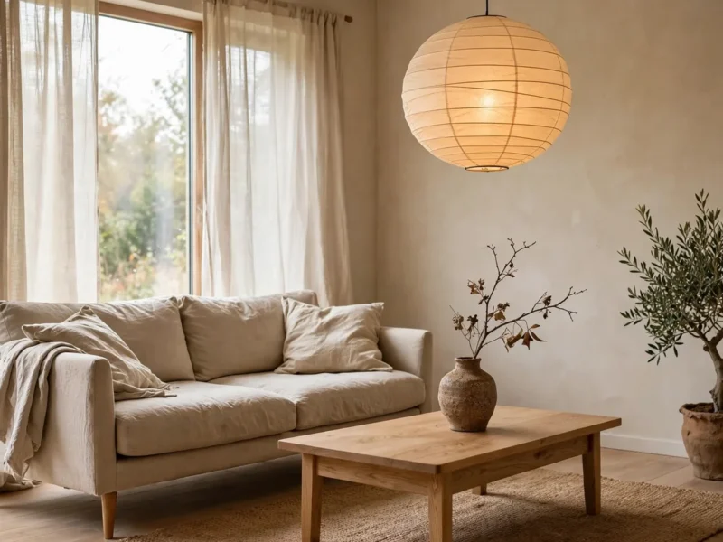
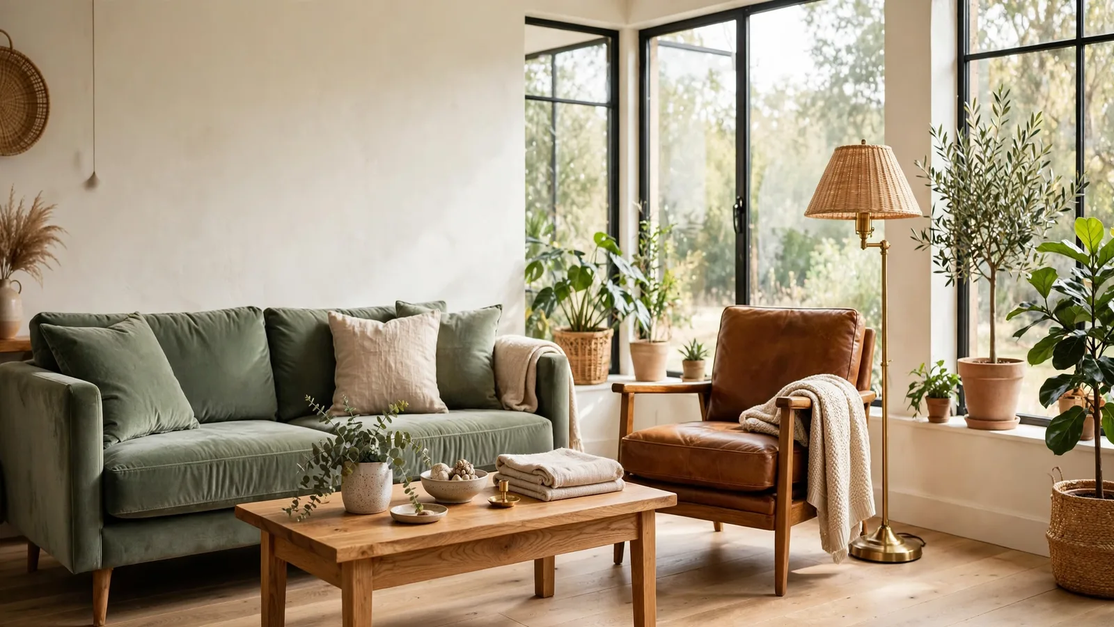
Sage green carries a warm undertone that makes it one of the most forgiving interior colour combinations for bedrooms — restful without going grey and gloomy. Pair it with creamy white linen bedding and a light oak bed frame so the room stays soft in morning light. It also holds up in north-facing rooms, where cooler greens can turn flat and lifeless.
3. Ivory + Butter Yellow (Kitchen)
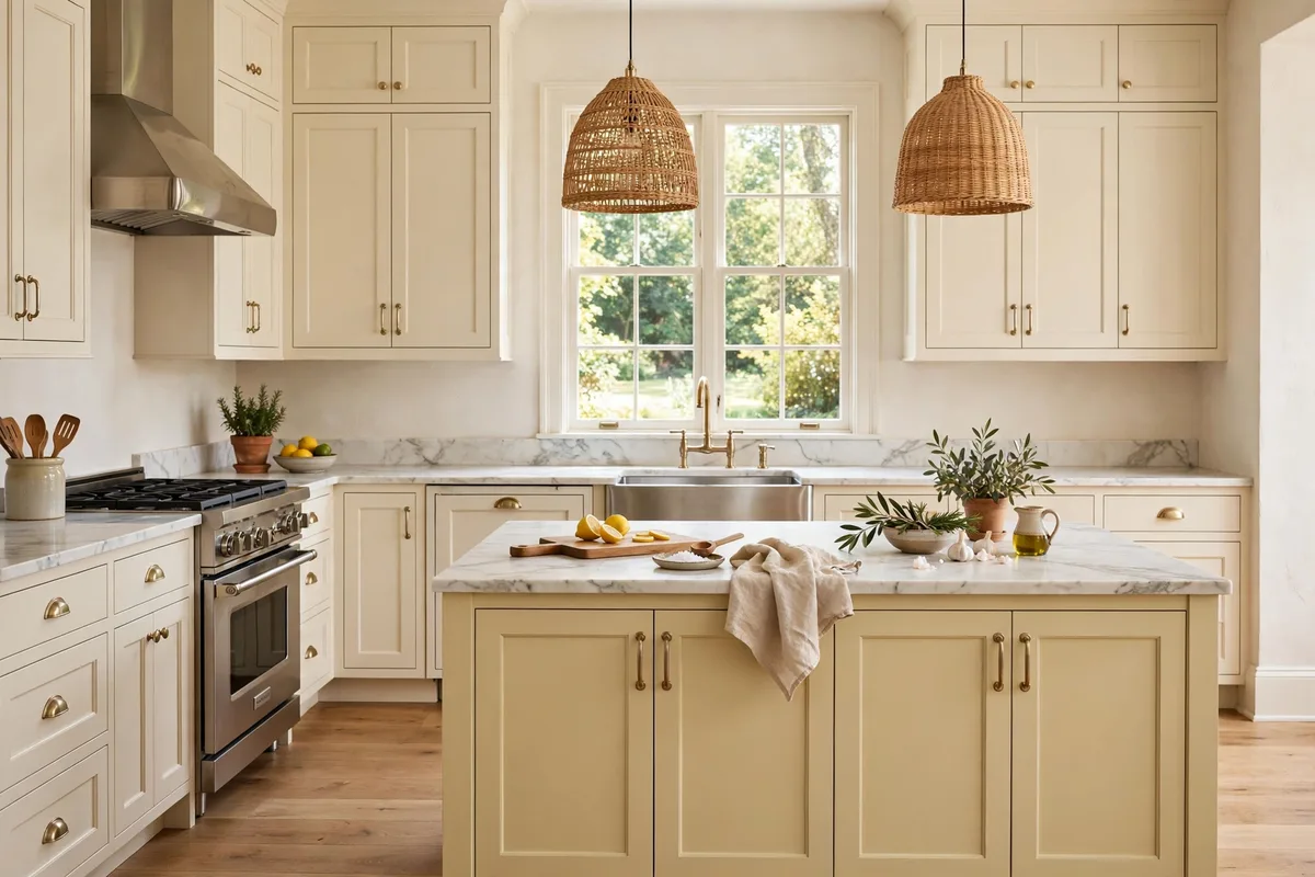
Kitchens handle cheerful colour better than any other room, and ivory shaker cabinets with a soft butter-yellow island stay bright without going neon. White marble countertops and brass handles add the warmth the palette needs. One of the freshest interior colour combinations for small kitchens, since the light tones bounce daylight into every corner.
4. Blush Pink + Warm Grey (Bedroom)
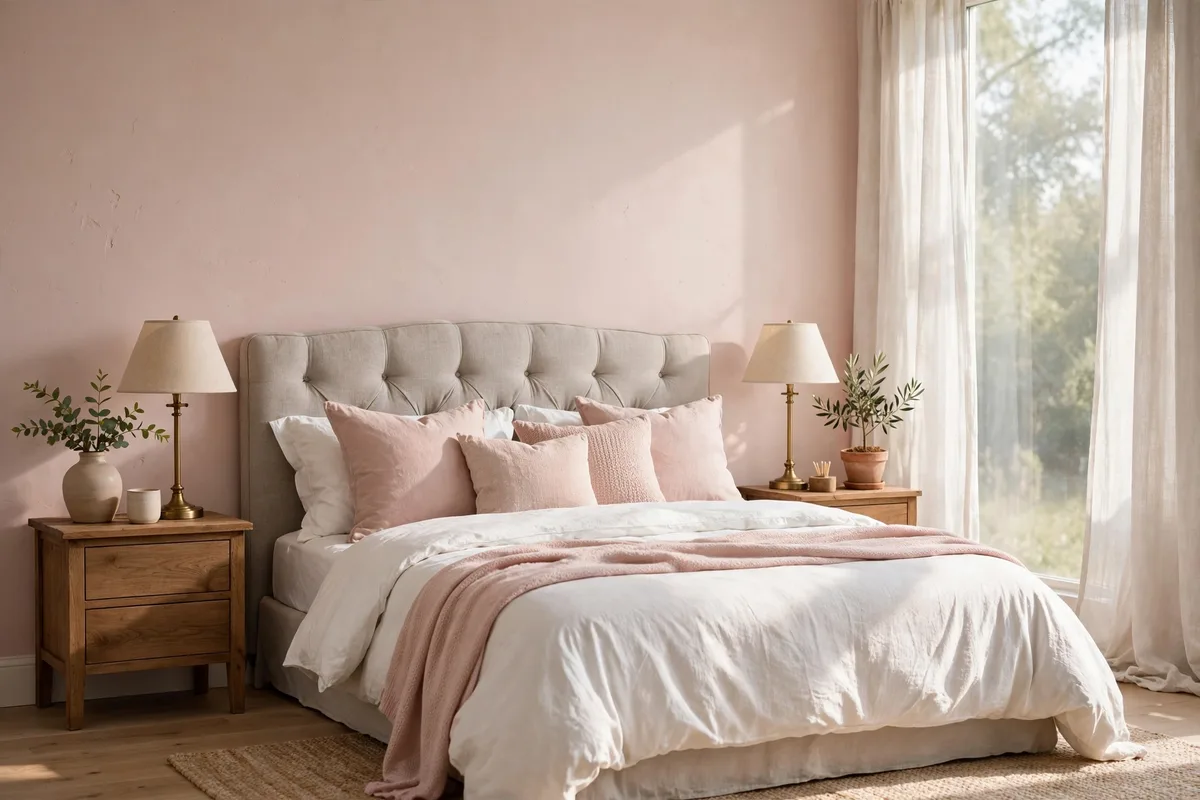
Blush pink stays grown-up when it’s grounded by warm grey — the grey stops the pink from reading nursery-sweet. Use pink on the walls with a grey upholstered headboard, or flip it: grey walls with blush bedding and throw pillows. Brass table lamps on both nightstands add the metal warmth this pairing needs.
5. Terracotta + Warm White (Living Room)
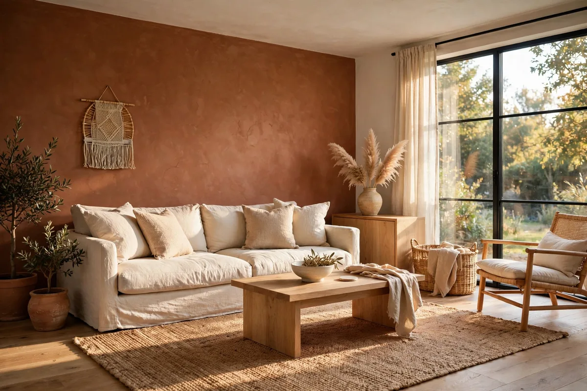
A terracotta accent wall brings sunset warmth into a living room, and warm white everywhere else keeps it from closing in. Natural textures — jute, rattan, light oak — are the bridge that makes this one of the most liveable interior colour combinations. Keep the terracotta to one or two walls; full-room coverage can overwhelm a smaller space.
6. Deep Burgundy + Cream (Dining Room)
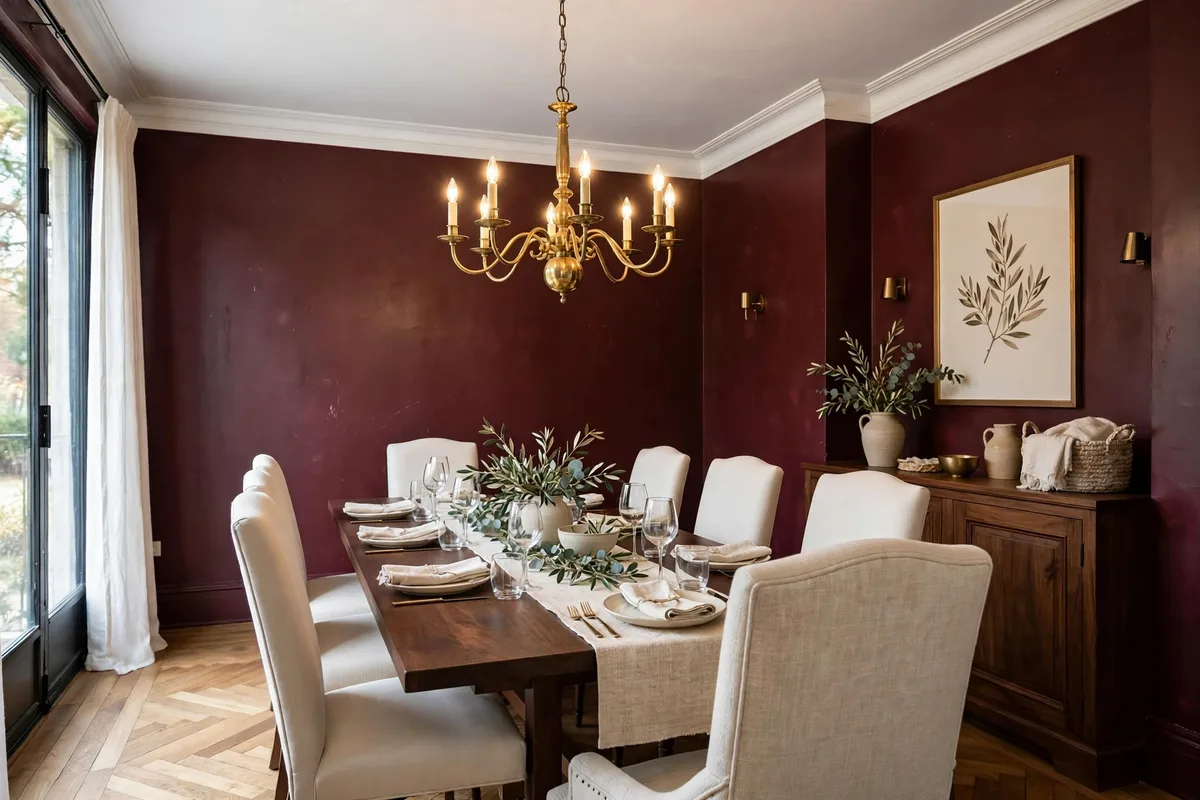
Deep burgundy walls turn a dining room into an evening space — candlelight loves this colour. Cream upholstered chairs and a dark walnut table keep it elegant instead of heavy, while a brass chandelier adds glow. Save this pairing for rooms with good natural light or strong artificial lighting, since burgundy absorbs light fast — one of the boldest interior colour combinations here.
7. Mint Green + White (Bathroom)
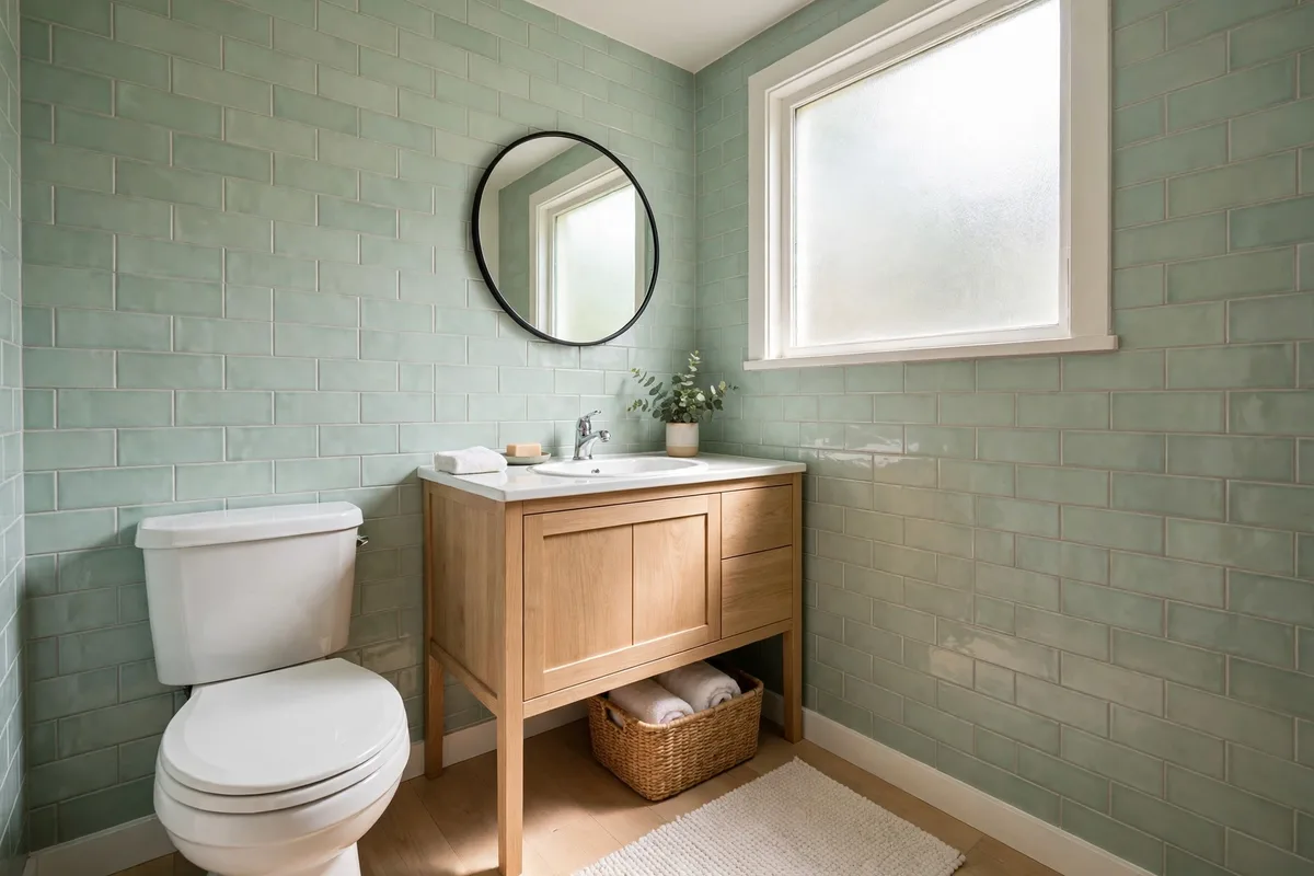
Mint green subway tiles with white porcelain fixtures give a bathroom a fresh, spa-like feel without the chill of a blue-grey. A light wood vanity warms the scheme, and white towels and grout keep it crisp. One of the cleanest interior colour combinations for small bathrooms, where darker tiles would shrink the space visually.
8. Olive Green + Cream (Home Office)
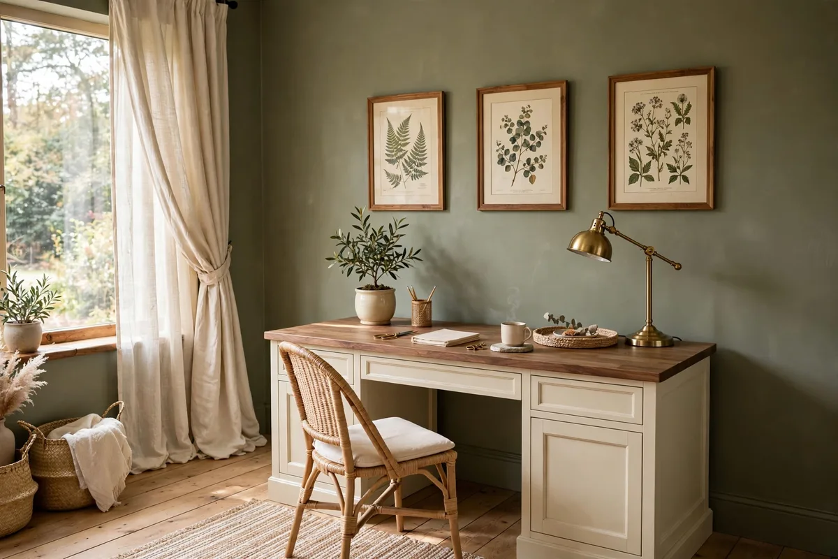
Muted olive green on the walls helps a home office feel focused and calm — green sits in the middle of the spectrum, so the eye rests on it. Cream desk fronts, a walnut top, and a brass lamp keep the room warm under task lighting. It’s a working colour, not just a pretty one — which makes it one of the smartest interior colour combinations for a study.
9. Teal + Slate Grey (Bedroom)
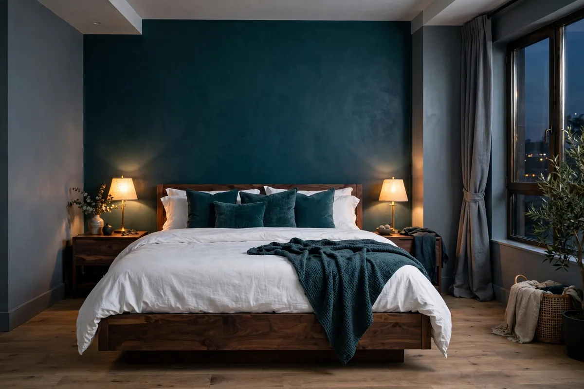
Deep teal on the headboard wall with medium slate grey on the rest gives a bedroom a cocooned, evening feel. Crisp white bedding and warm bedside lamps stop the dark tones from going gloomy. Save this pairing for larger bedrooms — dark walls pull the walls in, which feels cosy in a big room and cramped in a small one.
10. The 48-Hour Swatch Test
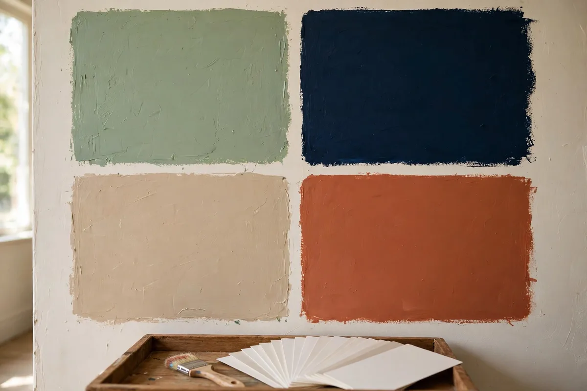
Before you commit to any of these interior colour combinations, paint 12-inch swatches directly on the wall and check them at 7am, 2pm, and 9pm over two days. A colour that looks wrong at any of those times will look wrong every day you live with it. Test pots cost a fraction of a repaint — the cheapest design decision you’ll ever make.
3 Rules Behind Every Pairing
Every pairing above is built on the same three principles. Learn them once and you can invent your own interior colour combinations with confidence.
- The 60-30-10 split. Give 60% of the room to a dominant colour (walls or a large rug), 30% to a secondary colour (upholstery), and 10% to an accent (pillows, art, hardware). When the 10% creeps toward 40%, the room starts feeling noisy and chaotic.
- Match the undertones. Two colours fail together when their undertones fight — warm beige walls against a cold grey sofa is the classic mismatch. Always include a “bridge” element, like a patterned rug or artwork that carries both colours, so the scheme feels connected. Design publication Tools and Hands demonstrates the split in practice: beige walls (60%), grey upholstery (30%), and muted sage or olive accents (10%).
- Read the light. North-facing rooms get cool, bluish light — warm colours balance them. South-facing rooms get warm light — cooler colours hold their own there. Natural daylight makes paint look brighter and cooler; evening lamplight warms the undertones up. Always test swatches under your actual bulbs.
Love these interior colour combinations? Save this guide to your home board so the room-by-room pairings are one tap away at the paint store.
FAQs
What is the best colour combination for a living room?
Beige and olive green, navy and white, and grey with wood tones are the most reliable living room pairings because they balance warmth and contrast. For drama, try a navy accent wall; for calm, sage green with cream. The key is matching undertones — warm with warm, cool with cool — so the colours feel related rather than collected.
How many colours should I use in one room?
Three is the sweet spot, following the 60-30-10 rule: 60% dominant colour (walls or a large rug), 30% secondary (upholstery), 10% accent (pillows, art, hardware). When the accent share creeps toward 40%, the room starts feeling noisy. Fewer, well-chosen colours always beat more colours fighting for attention.
How do I add colour without repainting walls?
Layer it in through rugs, cushions, curtains, artwork, and one accent chair. Pull one or two accent colours from a fabric or rug you already love, then repeat them in small doses around the room. Textiles are the cheapest way to test a palette — and the easiest to swap when your taste changes.
What are some relaxing bedroom colour combinations?
Muted lavender with ivory, warm grey with soft peach, or sage green with off-white all read calm and restful. Keep saturation low and let bedding and curtains carry the softer tones. Cool-leaning colours suit bedrooms best, but add warm wood or brass so the room never feels cold.
Good interior colour combinations are never accidents — they’re relationships between hues, chosen for the room’s job and its light. Start with the 60-30-10 split, keep the undertones in one family, and run the 48-hour swatch test before you buy the full tins. Your future self, living in the finished room, will thank you.
Which of these interior colour combinations are you trying first? Tell us in the comments — and share your paint shade if you’ve already committed to a tin.